Bootstrap List Group
Introduction
List group is a powerful and convenient component that is found in Bootstrap 4. The element is used for presenting a string or 'list' information. The list group items can easily be transformed and expanded to provide just about any kind of material within through some options easily available for customization inside the list in itself. These list groups can possibly as well be operated for site navigation together with making use of the right modifier class.
In Bootstrap 4, the Bootstrap List Item is a segment which styles the unordered lists in a specific manner since it paves the way for making custom made content just within system lists without any needing to worry about the demonstration problem ( because the language deals with that on its own). ( learn more here)
Capabilities of Bootstrap List Css:
Provided in this article are the elements that are obtainable inside the list group component within Bootstrap 4:
• Unordered list: The most standard form of list group that you can set up in Bootstrap 4 is an unordered list that has a series of elements by having the proper classes. You can certainly built upon it by having the additional options that are provided in the component.
• Active items: You have the ability to focus on the present active pick with just simply bring in the
.active.list-group-item• Disabled items: You are able to as well de-highlight a list item making it appear as though it has been actually disabled. You simply will have to add the
.disabled.list-group-item• Urls and Buttons: Through the buttons tag, you may easily develop an actionable element inside the Bootstrap List Item what means that you are going to have the capacity to provide hover, active, and disabled states to all of these elements with making use of the
.list-group-item-action<div><li>.btn• Contextual classes: This is an additional cool function that belongs to the list group component that allows you to style each list item with a specific color and background. These are specifically effective for emphasize some items or sorting all of them according to color-'s code.
• Badges: You are able to even bring in badges to a list thing to present the unread counts, activity on the item, and enable other interactive features through utilize a few other utilities. ( useful reference)
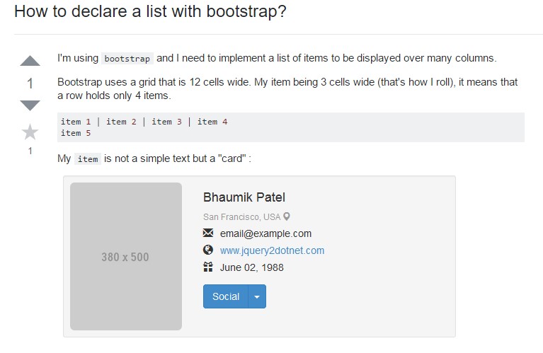
Let us see some examples
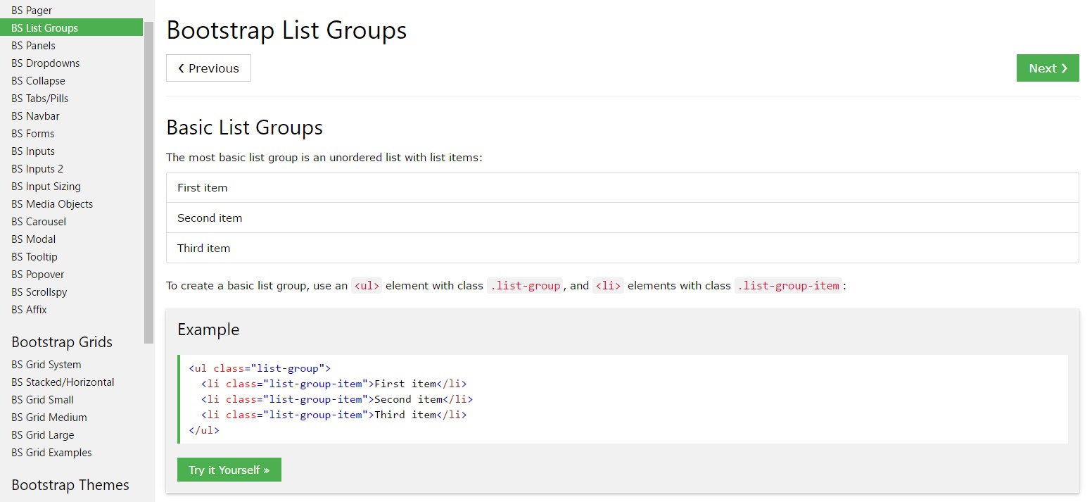
Basic example
The most standard list group is an unordered list plus list objects and the proper classes. Build upon it through the approaches that come next, or even using your particular CSS as desired.
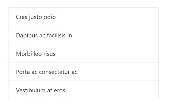
<ul class="list-group">
  <li class="list-group-item">Cras justo odio</li>
  <li class="list-group-item">Dapibus ac facilisis in</li>
  <li class="list-group-item">Morbi leo risus</li>
  <li class="list-group-item">Porta ac consectetur ac</li>
  <li class="list-group-item">Vestibulum at eros</li>
</ul>
Active items
Amplify a
.active.list-group-item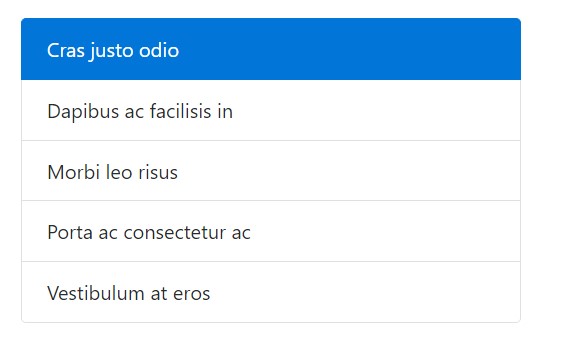
<ul class="list-group">
  <li class="list-group-item active">Cras justo odio</li>
  <li class="list-group-item">Dapibus ac facilisis in</li>
  <li class="list-group-item">Morbi leo risus</li>
  <li class="list-group-item">Porta ac consectetur ac</li>
  <li class="list-group-item">Vestibulum at eros</li>
</ul>
Disabled objects
Incorporate
.disabled.list-group-item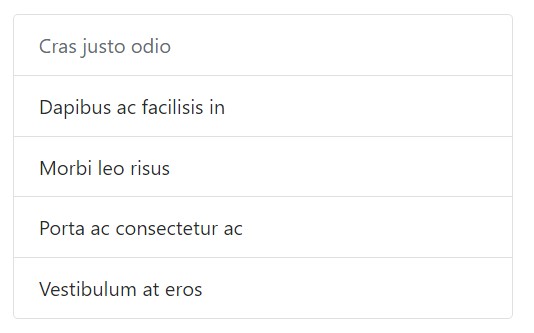
<ul class="list-group">
  <li class="list-group-item disabled">Cras justo odio</li>
  <li class="list-group-item">Dapibus ac facilisis in</li>
  <li class="list-group-item">Morbi leo risus</li>
  <li class="list-group-item">Porta ac consectetur ac</li>
  <li class="list-group-item">Vestibulum at eros</li>
</ul>
Hyper-links and buttons
Use
<a><button>.list-group-item-action<li><div>Don't forget to not work with the basic
.btn
<div class="list-group">
  <a href="#" class="list-group-item active">
    Cras justo odio
  </a>
  <a href="#" class="list-group-item list-group-item-action">Dapibus ac facilisis in</a>
  <a href="#" class="list-group-item list-group-item-action">Morbi leo risus</a>
  <a href="#" class="list-group-item list-group-item-action">Porta ac consectetur ac</a>
  <a href="#" class="list-group-item list-group-item-action disabled">Vestibulum at eros</a>
</div>
Through
<button>disabled.disabled<a>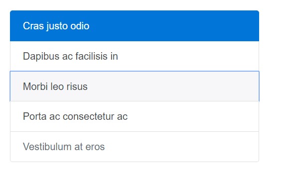
<div class="list-group">
  <button type="button" class="list-group-item list-group-item-action active">
    Cras justo odio
  </button>
  <button type="button" class="list-group-item list-group-item-action">Dapibus ac facilisis in</button>
  <button type="button" class="list-group-item list-group-item-action">Morbi leo risus</button>
  <button type="button" class="list-group-item list-group-item-action">Porta ac consectetur ac</button>
  <button type="button" class="list-group-item list-group-item-action" disabled>Vestibulum at eros</button>
</div>
Contextual classes
Use contextual classes to mode list items by a stateful background plus color tone.
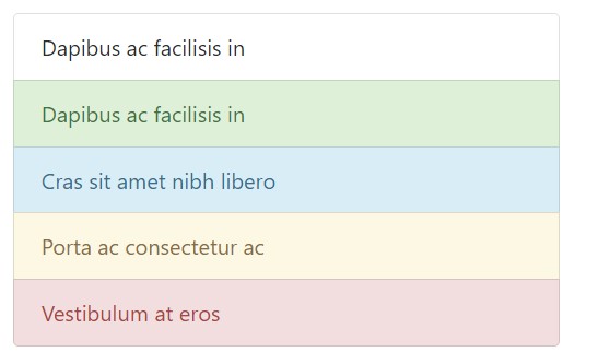
<ul class="list-group">
  <li class="list-group-item">Dapibus ac facilisis in</li>
  <li class="list-group-item list-group-item-success">Dapibus ac facilisis in</li>
  <li class="list-group-item list-group-item-info">Cras sit amet nibh libero</li>
  <li class="list-group-item list-group-item-warning">Porta ac consectetur ac</li>
  <li class="list-group-item list-group-item-danger">Vestibulum at eros</li>
</ul>
Contextual classes additionally operate with
.list-group-item-action.active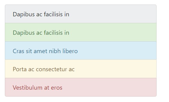
<div class="list-group">
  <a href="#" class="list-group-item list-group-item-action">Dapibus ac facilisis in</a>
  <a href="#" class="list-group-item list-group-item-action list-group-item-success">Dapibus ac facilisis in</a>
  <a href="#" class="list-group-item list-group-item-action list-group-item-info">Cras sit amet nibh libero</a>
  <a href="#" class="list-group-item list-group-item-action list-group-item-warning">Porta ac consectetur ac</a>
  <a href="#" class="list-group-item list-group-item-action list-group-item-danger">Vestibulum at eros</a>
</div>
Conveying meaning toward assistive technologies.
Utilizing color option to bring in meaning just provides a graphic indication, that will not be conveyed to operators of assistive technologies -- such as display screen readers. Ensure that relevant information indicated through the color tone is either obvious directly from the content in itself (e.g. the noticeable content), or is incorporated with other solutions, just like added text concealed with the
.sr-onlyWith badges
Add in badges to any type of list group item to show unread sums, activity, and more with various utilities. Keep in mind the justify-content-between utility class and the badge's positioning.
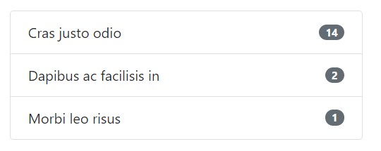
<ul class="list-group">
  <li class="list-group-item justify-content-between">
    Cras justo odio
    <span class="badge badge-default badge-pill">14</span>
  </li>
  <li class="list-group-item justify-content-between">
    Dapibus ac facilisis in
    <span class="badge badge-default badge-pill">2</span>
  </li>
  <li class="list-group-item justify-content-between">
    Morbi leo risus
    <span class="badge badge-default badge-pill">1</span>
  </li>
</ul>
Custom made content
Incorporate practically any HTML in, and even for linked list groups such as the one below, with the aid of flexbox utilities.
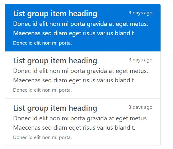
<div class="list-group">
  <a href="#" class="list-group-item list-group-item-action flex-column align-items-start active">
    <div class="d-flex w-100 justify-content-between">
      <h5 class="mb-1">List group item heading</h5>
      <small>3 days ago</small>
    </div>
    <p class="mb-1">Donec id elit non mi porta gravida at eget metus. Maecenas sed diam eget risus varius blandit.</p>
    <small>Donec id elit non mi porta.</small>
  </a>
  <a href="#" class="list-group-item list-group-item-action flex-column align-items-start">
    <div class="d-flex w-100 justify-content-between">
      <h5 class="mb-1">List group item heading</h5>
      <small class="text-muted">3 days ago</small>
    </div>
    <p class="mb-1">Donec id elit non mi porta gravida at eget metus. Maecenas sed diam eget risus varius blandit.</p>
    <small class="text-muted">Donec id elit non mi porta.</small>
  </a>
</div>
Conclusions
In conclusion, list group is a handy and powerful component within Bootstrap 4 which empowers you to create an unordered list more organized, interactive, and responsive without risking on the visual aspect or else layout of the list pieces themselves.
Inspect a number of youtube video training about Bootstrap list:
Connected topics:
Bootstrap list approved documentation
Bootstrap list guide
Bootstrap list issue